131月
全球设计风向感谢来自 十砚设计 的办公室项目案例分享:
设计概念 Design Concept
本案为策略顾问公司,对于客户的隐私十分重视,“低调隐蔽”是此次设计的首要需求,基于过多的隔区会使空间显得窄隘,在与业主协商后,十砚设计 陈逸群 设计总监、锺馥如 总监 在一定限度里设置隔间,使结果不致影响动线,让场域有所区隔却仍具备开放性,并于美式风格上,以不宣扬却精致的Art Deco概念,作为缪思女神,处处留迹。
A strategic consulting corporation, which attaches great importance to the privacy of the customers, therefore, “low profile and privateness” would be the principle of the design notion. Due to excessive compartment might bring about narrow and limited space, hence, LNF Design Firm Creative Director Lawrence Chen and Director Fran Jong consult with the property owner to meet the best solution of setting up the fewest partition, at the same time create the smooth flow, as well making an open yet covert space. By means of the concept of American style, just like the goddess of Muse, the unobtrusive but exquisite Art Deco leave traces everywhere.
设计手法 Design Techniques
Art Deco图像贯穿全景 Art Deco elements reveal the layout
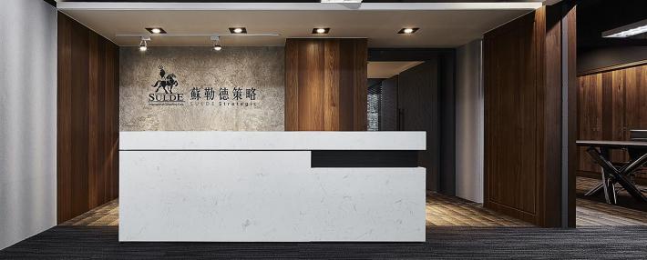
以客群高端的法律事务所为端景,转化纽约黄金时期的风格,取材自Art Deco概念,运用图腾编排的方式点缀空间,加以几何形状搭配,低调华丽,暗藏金色质感,使空间的风格不受局限。
Emulating the high-end law firm as the striking end view of the space, and convert the style of the golden age of New York, draw on the concept of Art Deco. Exploit the totem arrangements to embellish the space, and go with the geometric shapes of golden texture, so as to present the low-key yet magnificent feature.
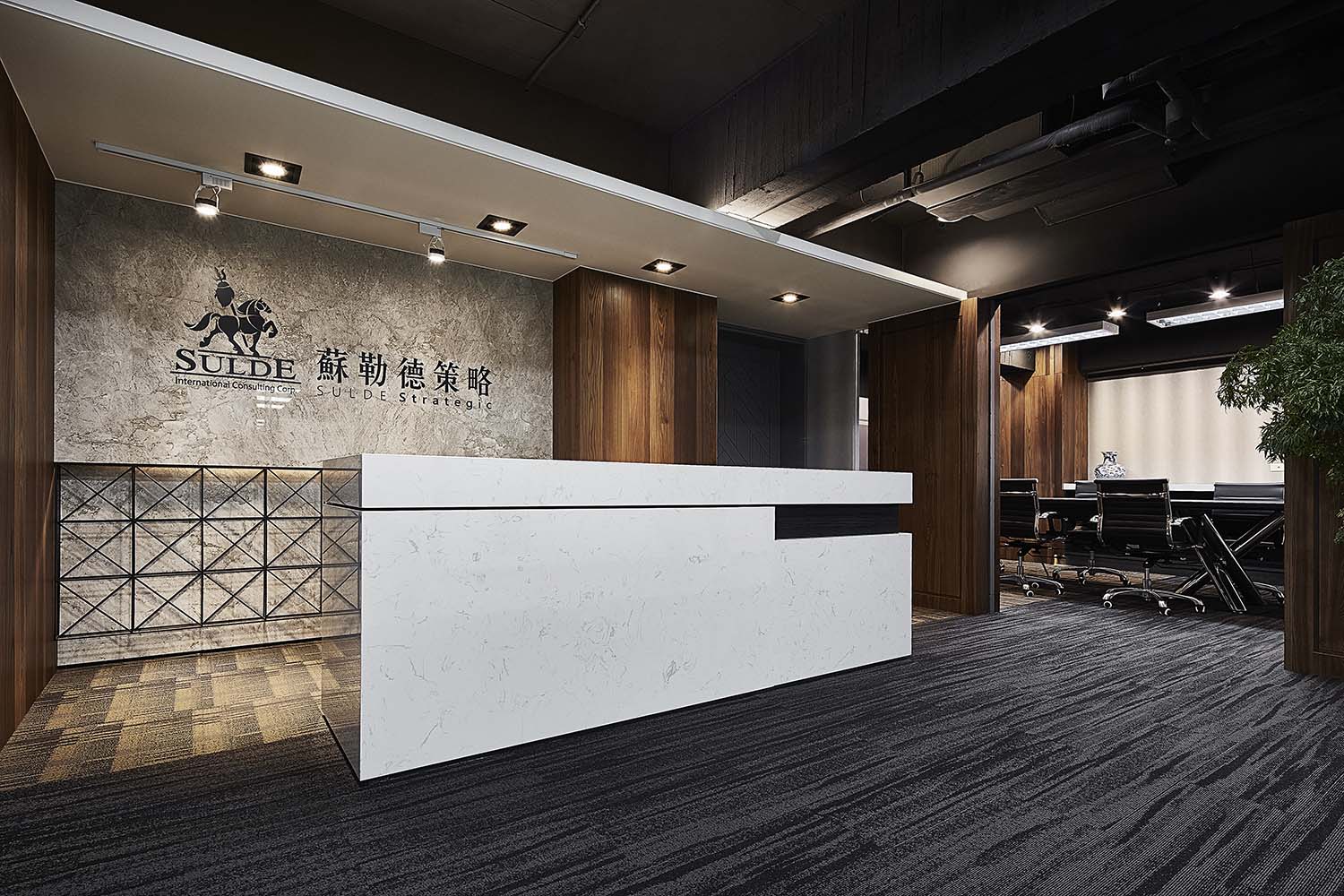
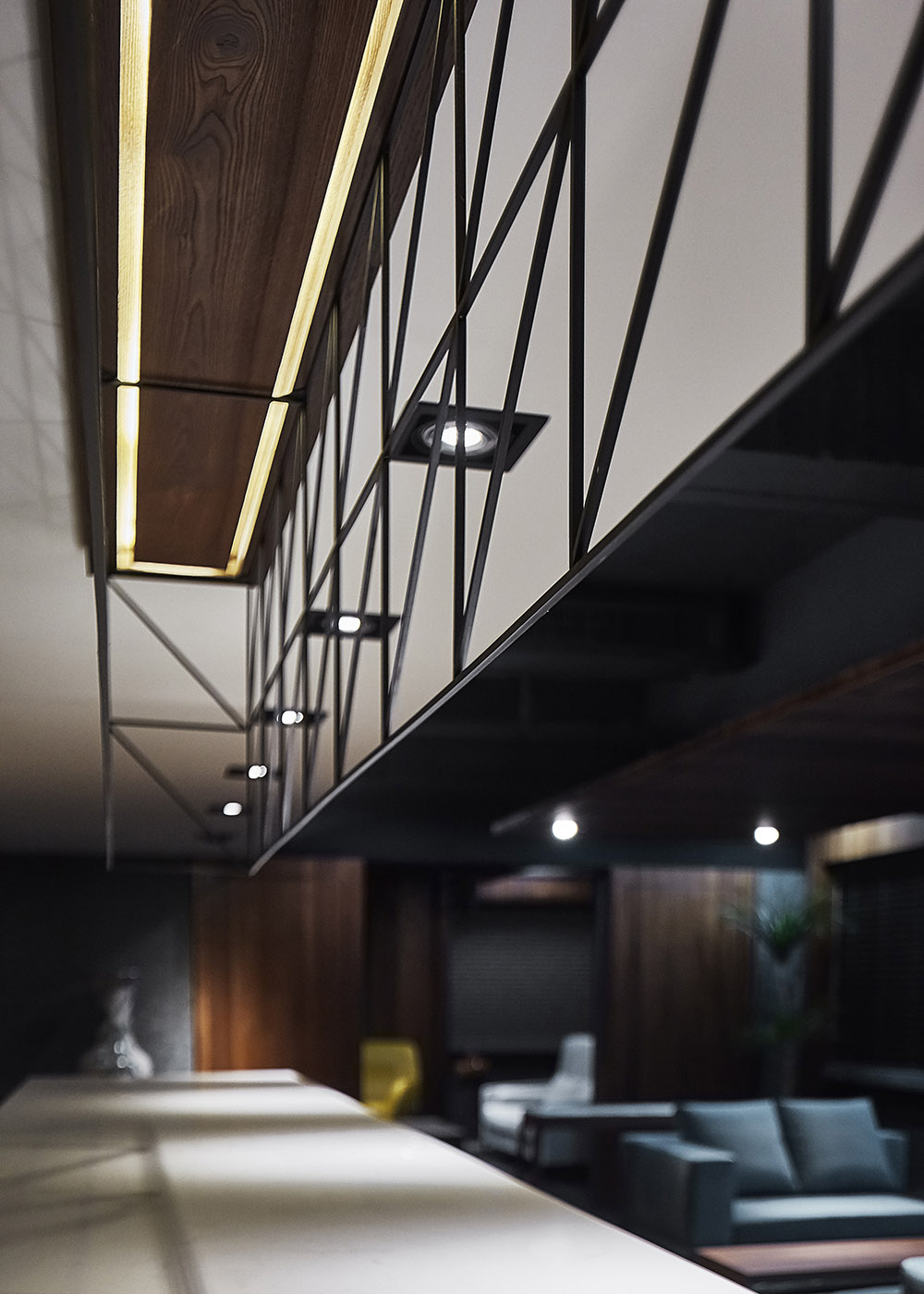
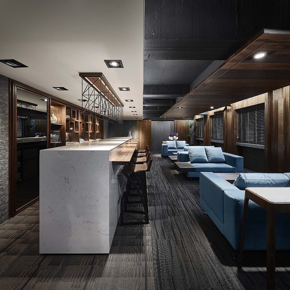
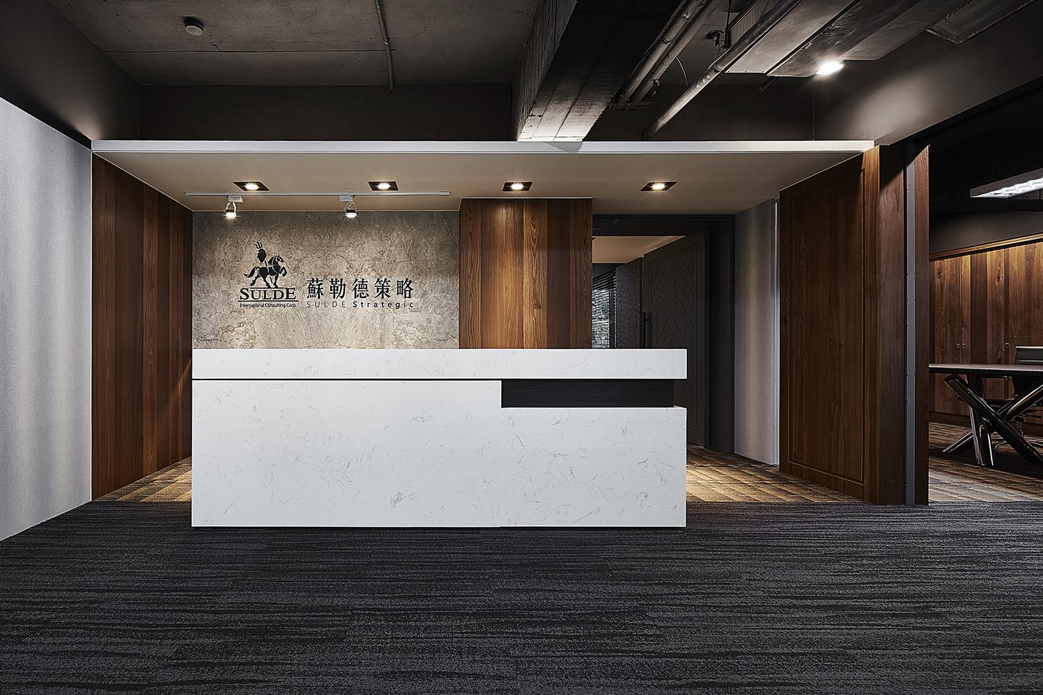
偶可见于装饰中的金属铁件,亦源自其概念风格,由于是策略公司,柜台和自由洽谈空间皆置入铁工制作饰物,双层交叠的铁饰左右交错,增添层次之余,呈现谈判间的来回意象,铺叙沟通往来与和谐结束的画面感。
The metal iron pieces that can be seen occasionally also come from the Art Deco concept. Since it is a strategic company, the double-layer iron art crafts of the reception counter and the consulting space, besides casting the layering vision, in the meantime presenting the atmosphere of negotiations, and brings out the picture of well communication and successful agreement.
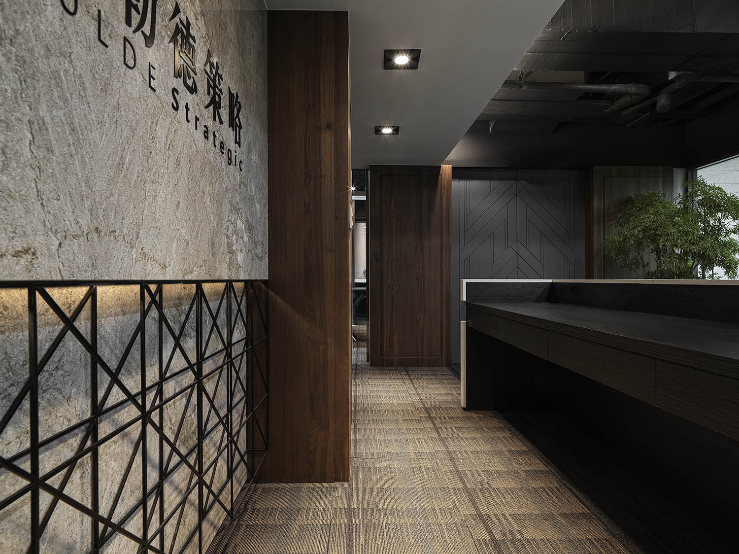
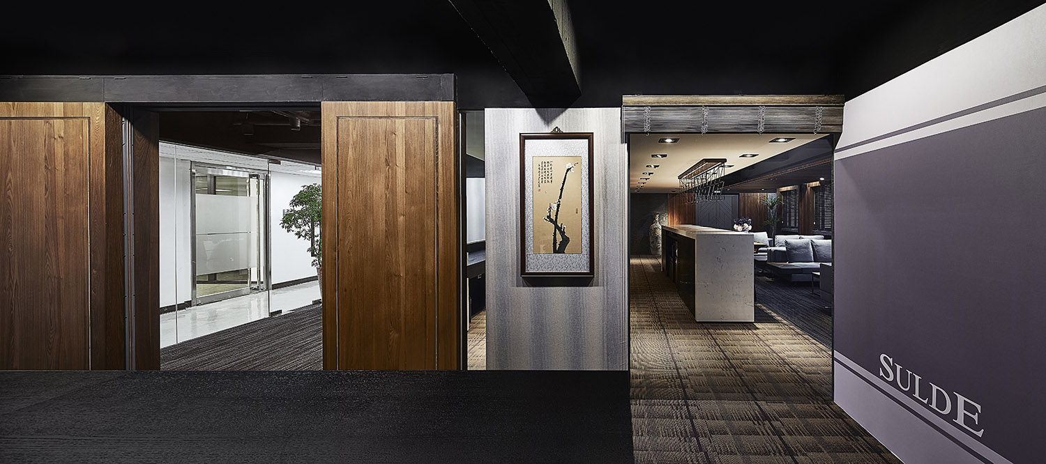
∇ 空间中有许多出入口,是在隐蔽之间寻找开关平衡的最终结果
美式深蕴潜移默化 American subtle factors exert influences unwittingly
有鉴于场域的格局限制,在尽可能让视觉穿透的情形下,设法兼顾隐私,并透过材质变化,采用灰镜、灰玻与茶玻,制造视觉上的错觉,进一步起到心理暗示的作用,让观者视感相较实际场域来得益加宽敞。而美式风格的形制,则表现于家具上,运用软装布置聚焦视觉,成为空间中的丰富剪影。
暗门满布,除了让客人自由进出不受打扰外,也使得空间有开放性的视觉效果。在材料上,大量使用原木包覆,线条上则采用美国黄金时期的工业风,以细致金属装饰呈现美好年代的绝美风华。
Although limited by the pattern of the space, we go all in to create an open layout, and at the same time to keep the privacy. We select grey mirror, grey glass, and tawny glass to manifest the optical illusions, further playing the role of psychological hint, so that people would lead to a spacious concept. Moreover, exploit the soft decoration of the American style to shape the stunning focal point of the space.
Set up several secret panels, which not only allows the visitors to enter and leave freely, but also makes the space with an open visual effect. The natural timber and fine metal linear texture of the Loft style that present the stylish feature of the golden age of the United States.
天地壁化整各有所依 The ceiling, floor, and wall show their exclusive texture
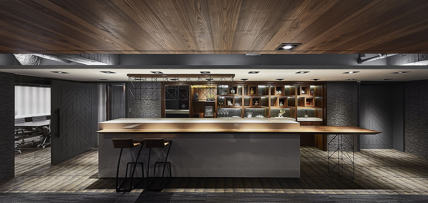
烟熏过的榆木丰富视觉、味觉与触觉体验,以特有的纹理与气味替空间增色。除了将深色木质调作为主视觉外,形形色色的壁纸亦增添立面变化,加强层次与空间广度;地坪部分铺展方块地毯,相同材质但花色各异,使每寸空间皆予人截然不同的丰富视感,涵盖各自的深邃气质。
除隐藏及流畅的动线设置外,尚有弹性规划的场所。混合办公、洽谈室等功能的长方形场域,有着半包覆半裸露的天花板,在顺应老屋低矮构造之余,显现主配角的反差景象:不加修饰的灰黑质地天花管线、梁架曝于眼前,与一旁白色及原木色的天壁,形成视觉上的冲突对比,典雅却具备粗犷特质,两者反差使人仿佛置身魔幻场景。
The smoked elm contains distinct texture and aroma that riches the smell and tactile sensation of the space. We make use of the solid wood tone as the accent color, and take the advantages of various wallpapers to bring about the captivating finish; and then pave the floor with square carpets of different colors, as well forming the visual intrigue of each area.
The rectangular pattern is flexibly utilized as an office or consulting area. In order to comply with the low structure of the vintage house, further to present the great difference image, we construct half ceiling of unmodified pipelines and beams, and another half part of clear white paint goes with a solid timber, consequently create the visual conflict contrast. The refined and rustic contrast ingeniously makes people feel as if they are in a magical scene.
巧思妙笔形塑双风貌 Excellent techniques create dual themes
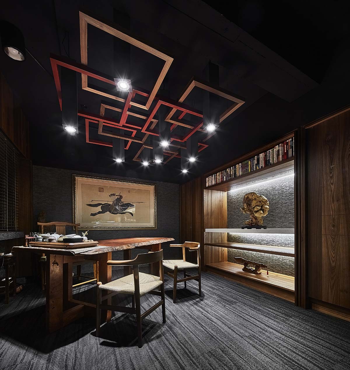
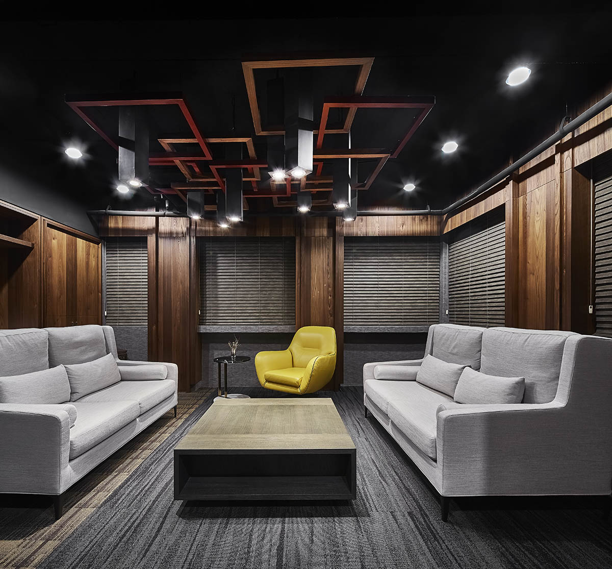
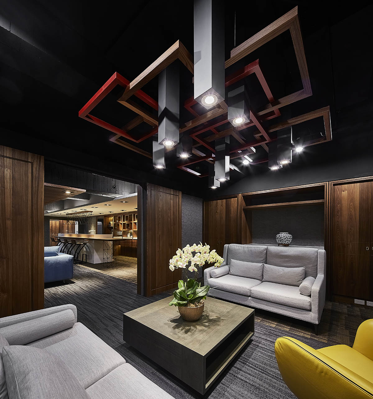
VIP室兼主管办公室的天花板,更有风格突破性的几何灯柱;在古风氤氲的处所中,以中国窗櫺为发想,融合空间主人之收藏,将几何方框作为风格链接,避免感受上的直接冲突;打散的几何形状高低各异,创造一个媒合、两种理念的丰富效果,使人恍如身处界线模糊的双风格情境中。
在量体隔间众多的情况下,追求开放的视觉感受,于场域内设计诸多暗门及出入口,另一方面兼顾公司客户的隐私需求,使其能自由出入不受打扰,一方面亦满足公司和设计师协调的结果。综观全场,原木包覆的美国黄金时期工业风,和几何图形的转换,媒合调性各异的场所,妙手工笔融合中国、美式等风格于一,构建和谐而富变化的对话空间。
The ceiling of the space that serves as the VIP room and the competent office hung with several glamorous geometric lightings; the notion is inspired of the window lattice of the ancient China, furthermore, make use of square frames as the connection of different styles. The layering geometric shapes vary in height that creates the charm feature of dual situations.
Base on the concordance of the proprietor and the designer, we set up several secret entrances of the space, besides creating the smooth flow pattern, on the other hand, to achieve the privacy requirement of the customers, the layout allows them can enter and leave freely without interruption. In a comprehensive view, the Loft style of American golden age and assort with the geometric figures, which integrate various tones of each area. Excellent design techniques merge the Chinese and American styles; hence bring about a harmonious and multifarious space.

